
Become a superhero, handle your data with R
Outline
Introduction
Programming
As a visual learner, I was at first turned off to programming because it took away the graphical interfaces in software programs I was accustomed to interacting with. The graphical user interface (GUI) is the portion of a program that contains the buttons you push, the bars you scroll, the windows you type in, etc. Basically a GUI is the visual component connecting you to the program. When you first start to learn programming, you lose the visual crutch of your computing environment almost completely and must learn new ways to interact. Your tactile interaction with the GUI is replaced with plain text in the form of the programming language. You may lose your “sight”, but every time you feel and bump around you gain a clearer and clearer understanding of this new environment.

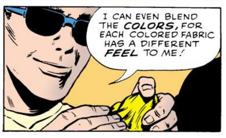
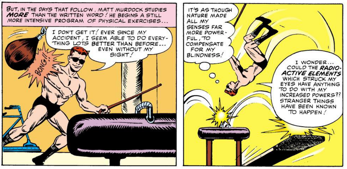
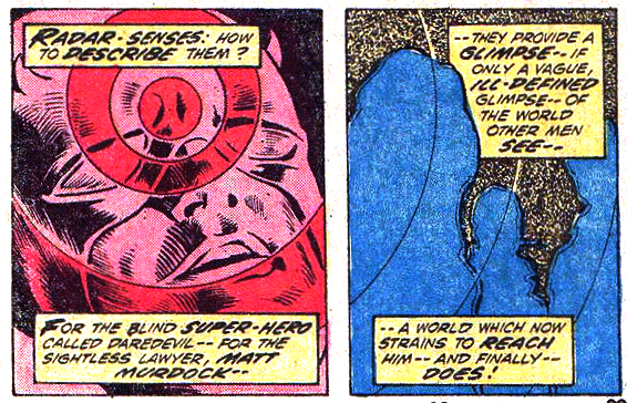
Hey, did you see that horrible superhero movie Daredevil? You know, the one with Ben Affleck? Either did I, but I do know a little of the back story of the Marvel Comic superhero Daredevil. It is the story of a man who loses his sight (funny enough, by trying to save a blind man) when a radioactive substance spills onto him. Although he loses his sight, his other senses become heightened and as a result he attains super human powers. This is a great analogy to someone beginning to switch from GUI based environments, like Excel, to a new programing environment, like R. Just like Daredevil’s first day as a superhero, after losing your “sight” you will touch, feel, and of course bump into things. Actually, many of the most basic of programming commands are just simple things you type to gain an understanding of your environment. Every object in R can be defined in countless ways that are not possible to understand from a simple visual representation offered by a visual based GUI. Daredevil lost his sight, but gained the power of echo location, achieving an insight into his surroundings not capable from sight alone. Eventually you stop grasping around you and begin to learn more advanced concepts and you will be able to just glide through to exactly where you want to be. Programming will allow you to stop spending endless amounts of time searching for the correct button for the tool you want to use, instead, you literally just tell the program what you want done. You can even make tools there aren’t even buttons for. Hell, you can make tools that the world has never seen. The question is will you use your super powers for good or evil?
This Tutorial
There is only one way to truly learn programming and that is to spend a lot of time programming. This is not meant to scare you away from programming, but to free you from being so hard on yourself during frustrating times. No one learns how to program properly fast. Therefore, you will not learn how to program or master R in this tutorial. What you will gain is an understanding of the power of programming and a glimpse of what is possible when using R for data manipulation, visualization, and analysis.
I learned R as a requirement for my PhD studies to handle data. I began to realize the power of programming and most importantly, how incredibly fun the learning process is. From slowly learning other languages I began to realize that there are fundamental concepts that are repeated throughout programming that I wish I had known when I started to learn R. Often times, teaching guides to programming omit very basic details because most programmers think of them as second nature. In this tutorial I try to make the material as transparent as possible, often going a bit more into detail of concepts/directions, many times omitted in other tutorials. I have included them because either I, or someone who I have taught, needed the extra details to understand what is going on.
This tutorial is meant for individuals interested in learning the basics of R for simple statistics and data visualization. I have been teaching R to undergraduate students and high schoolers interested in a career in biological science, but almost of all of the material requires no knowledge of biology. Most people who are new to programming, but want to start with R are familiar with doing similar tasks in Excel, so whenever possible I make comparison to how R and Excel are the same and and how they are different. This tutorial is written under the assumption that the reader has little to no programming experience, therefore many beginning coding concepts are also introduced.
Some basic tips when learning programming:
- Type everything. I know you can just copy and paste from the tutorial, but do yourself a favor and type it out. You will start learning the subtleties of the syntax and get used to typing in new ways.
- Break everything and make mistakes. When you run code that gives you the results you want, don’t stop there. Change the wording, change the symbols, try different combinations. You reinforce what is correct by understanding what is wrong and of course how to fix mistakes. Learning to fix mistakes is the fastest most effective way of learning programming (actually this is true when learning anything).
- Teach others. One way to make sure you understand a concept is to explain it to someone else.
R and Programming Basics
Getting Started
Before you start this tutorial, download R and install the standard download of R. If you already have R, but haven’t used the program in awhile, it is a good idea to check for recent updates of the program. You can do this by using the drop-down menu R > Check For R Updates. Maybe you were given the suggestion to use R-Studio, which is a great way to start using R, but this tutorial is written for the standard download version. Most of what is taught should be applicable with R studio though, some code that is introduced may even have a button in R Studio, but it is up to you to find it.
Download this folder, which contains the datasets and beginning sourceFile.
Go ahead and unzip the package and you should now have a folder/directory with four files: 1. hypocotyl.csv 2. sourceFile.R 3. stereotypes.csv 4. stereotypes.xls
The Working Directory
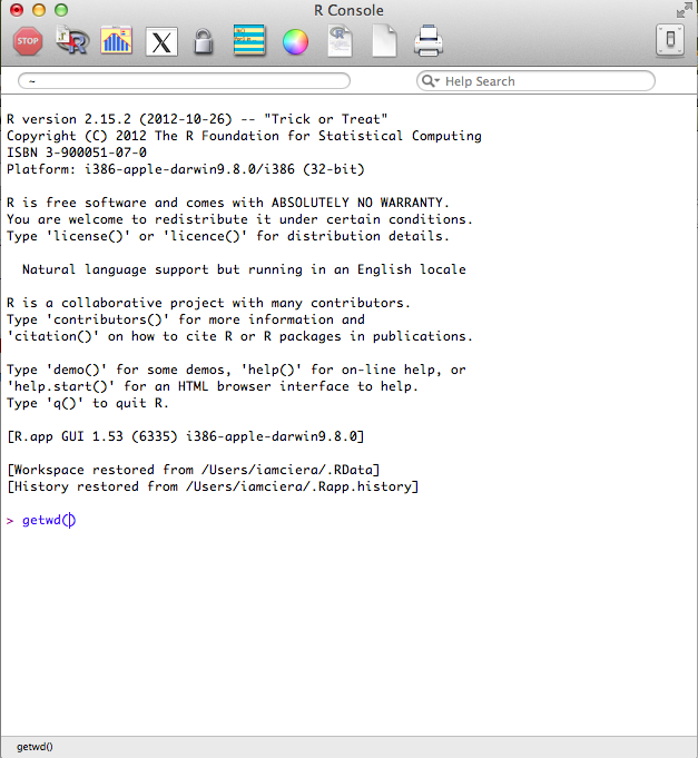
When you open R, the R Console window should appear. This is where all the operations can be run directly. The last line will begin with the > prompt icon. This is where you can start interacting with the R environment (see image below).
Let us continue with the analogy that you are recently blinded. Your first instinct would be to grasp around you and figure out where you are. Many processes must all take place in the same directory (folder); your working directory. Your working directory in this case, is your r_tutorial folder. Lets ask R where our working directory is by typing getwd(). This returns a path to where R thinks your working directory is, which is not where you want to be. We need to specify to R, where our working directory is. You want your working directory to be in the “r_tutorial” folder that contains everything you need for this tutorial.
There are two easy ways to set the working directory using the standard R installation.
- If you are familiar with how paths work, you can enter use the
setwd()function and enter your path in quotations after the parenthesis.
setwd("path/to/yourworkingdirectory/R_Tutorial")
- You can also set your working directory using the Misc dropdown menu on the top navigation bar and choose Change Working Directory. This will prompt a window where you can manually choose the R_Tutorial folder.
Are we in the correct location? Check once again if we are in the correct working directory using getwd(). This is something you will need to do every single time you start using R. This is a common source for many beginning errors you may encounter. So always check and re-check if your working directory is in the folder that contains your data and source files.
The Source File
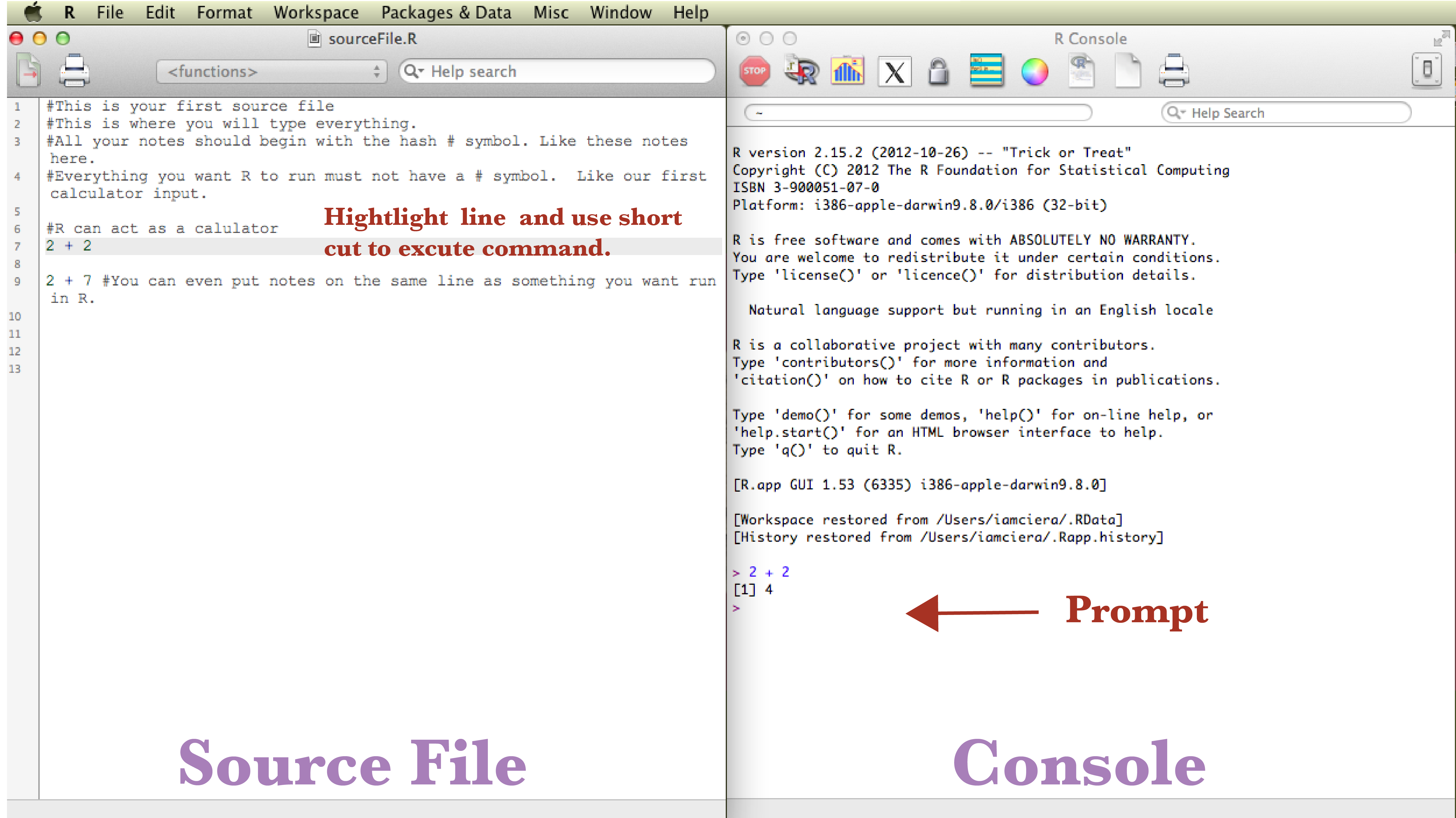
You can type everything into the console directly, but since you want to keep a history of what you are doing, it is best practice to write into a source file. Your source file is just a text file that holds the history of your coding and notes. In the future you can come back to it to re-run the entire file or in this case, to help you remember what you have done each day as you run the tutorial. Source files end in the extension .R. You can start a new source file under the Drop-down menu File -> New Document. Or you can open existing source files by choosing Open Document. Go ahead and open the sourceFile.R file. You will see some notes that begin with a # hash symbol, which uncomments the code. You must always proceed notes/comments that you don’t want R, as a program, to run with #. While taking advantage of #, it is important to record notes on what works and more importantly what doesn’t work and make notes on why it didn’t work, especially while learning.
R as a calculator
R in its simplest form can act as a powerful calculator. In your source file, 2 + 2 will be written, place your cursor on the line in the source window where 2 + 2 is written and hit run by using a keyboard shortcut: 1. mac user’s shortcut ⌘ + enter 2. PC user’s shortcut ctrl + r. This sends the code to the console where it is run.
Activity Break
Try typing in some basic calculations.
2 + 2
2 + 3
Try typing in some more complex calculations.
(2 + 3) * (4 + 5)
Try to type a calculation that includes addition, subtraction, multiplication, and division.
Content
Now that you have a basic idea of the environment you are in, it is time to understand the objects in this environment, the data. You will learn to touch and manipulate the data, which will help you start revealing patterns that exist within the data you touch.
One main feature of programming languages is that you can assign an object to represent a value. In R, this is done using <- which is called the “assignment operator”, but most people commonly refer to it as “the arrow”. Many languages use =, which also works in R, but there are subtle differences. If you want to read more about assignment operators, see discussion here and here.
Type the below code into your source file. Make notes using the # to record your coding history in plain English. I will add a few notes to some of them, you try to take notes on the rest. Again, it is good practice to keep notes, especially when learning.
x <- 2 # This is assigning x to the value of 2.
y <- 3
x + x # Since x = 2, the result of this code is 4.
x * y
You can use letters, digits, and periods, alone or in combination as an object name, but never with spaces. Naming objects can cause problems in certain circumstances. Some text is used for specific purposes in R, for instance T and F are the standard abbreviation for TRUE and FALSE. Many times this won’t affect your scripts, but it is something to keep in mind. Here is a simple article going into a bit more detail.
You can even use the arrow to name the results of code.
xplusx <- x + x # Since x = 2, x + x = 4. This is assigning the value of 4 to xplusx.
You can simply type xplusx to check value.
xplusx
[1] 4
xplusx * y
[1] 12
Always try to name objects with a name that is unique and descriptive. This will make your life easier when you come back to the source file and most importantly your code clearer for other people who may read your script.
Much of programming is composed of the interaction of functions and objects (also called arguments). You can think of a function as an activity and the object is what you act upon. Functions are defined in the R program. For instance the sum() function. I bet you can predict what sum() does. Try it out.
sum(x, y, x, x) #make your own note what is going on here
R contains many built in functions and it may take sometime to become familiar with what functions are available. One thing to keep in mind is, if you are coming from Excel, and there is a button for it in Excel, there is a function for it in R. Since you are now blind and cannot see all the awesome options R has in front of you, just ask for help.
There are two main ways to ask for help
-
Google it. Since R is open source, there is a giant community that is out there to help you, use it.
-
Use the help option. You can just type
?in front of any function to learn about it.?sum(). Many times the help files are a bit complex, but as you read more and more, you understand them more and more. There is usually an Examples section at the end of these help files that can be very helpful, even for beginners.
Data
Data can come in many different structures, but they all must follow rules to be used by R efficiently and effectively. The first hurdle when dealing with data is understanding data organization and structure. This is an incredibly dense topic, as data is often structured to serve specific purposes. If you are a researcher who is generating data, plan your data structure before you start collecting data, spend some time thinking about how you want to approach your analysis in the future. A large portion of big data analysis is spent on restructuring and clarification of inconsistencies found in datasets. I cannot repeat this enough, a large portion of big data analysis is spent on cleaning up data. The great part is that structuring your data becomes intuitive quickly the more you work with data in R. We will only briefly discuss data structures in this tutorial, but keep in mind that an understanding of data structuring makes a huge difference in understanding how R works and further how to get as much out of your data as possible. See the Resources section to learn more about data structures.
Vectors
The most basic data structure in R is a vector, which is simply a list of numbers.
One way to make a vector is using the c() function.
weight <- c(60, 72, 57, 90, 95, 72)
height <- c(1.75, 1.8, 1.65, 1.9, 1.74, 1.91)
What is this c() function? One of the keys to learning programming is to be curious about everything.
Every time you are presented with code that is unfamiliar to you
- Ask: Do I understand every detail of the code?
- Try to translate the code to plain English.
- Play with it. Delete things, add things, and rearrange. Don’t be afraid, try it, it’s fun!
So what did we just do? What do you think c() does? To get a better idea lets call the variables which are now vector objects called height and weight.
height
[1] 1.75 1.80 1.65 1.90 1.74 1.91
weight
[1] 60 72 57 90 95 72
Activity Break
-
Describe in plain English what
c()does. -
Compare your answer to the
c()help file, which can be called with?c(). -
Make a comment in your code explaining to yourself using a “hash tag”
#. Don’t forget, anytime you precede text with#, it is not read into your code. -
Make a vector called “myFamily” that lists all the ages in your immediate family.
Let’s get back to the first of our datasets the vectors height and weight. We can do more complex calculations with these.
bmi <- weight/height
When you divide weight by height you get the Body Mass Index (BMI). Let’s take a quick look at the distribution of bmi.
plot(bmi)

The plot function is a simple way to quickly visualize simple plotting.
Activity Break
-
Write a function to get the average age of people in your
myFamilydataset. Oh I didn’t tell you what the average function is? Looks like you have to google it. -
Make a plot that has
weighton the x-axis andheighton the y-axis using theplot().
In my opinion, the best part about using R is visualizing data. I know, I know, this plot is not impressive and you certainly can make a more beautiful plots in Excel. This is just the simplest way to visualize your data. I will spend a lot more time explaining how powerful R is as a tool to visualize data later, don’t worry.
Importing Data
We just went through how you make a simple vector data set directly in R, but most people import their data from other sources. Some people just export their data from other database programs, like Excel for example. The Excel default file extension is .xlsx. These types of files allow you to color code your data, make multiple sheets on one data file, and apply functions within cells. Don’t get me wrong, these tools are great if your intention is to organize and analyze small data sets and have no plans to share your analysis. If you must use .xlsx files for your data, it is good practice to also have an updated version of the data file in plain text, so you can share it. Most bioinformaticians, statisticians, and all other data crazed people, will expect a data file in plain text.
This comes to a very important lesson in programming: Use plain text. Plain text is essentially what is sounds like, a simple interchangeable way to view text.
Using plain text allows
-
Portability: You can open a plain text file in any operating system from mac to PC to iPhone to a computer from the 80s. I expect that a computer in 25 years will still be able to open that plain text file. You can also open text files in pretty much any program. You can open your data in R, Excel, textedit (mac), notepad (PC), ect., basically any program that reads text.
-
Easy to Create: To create a plain text file you simple type into a blank file. That’s it.
-
Light: Since these files are only text, they are incredibly light, making them take up little hard drive space and open incredibly fast.
The most common basic text file extensions that can be opened by R is .txt and .csv (comma delimited). There are two identical data sets in your folder stereotypes.csv and stereotypes.xslx.
Activity Break
First let us see how different these file types really are. Lets leave R to investigate further.
-
Using either Textedit or Notepad, open stereotypes.xslx.
-
Using either Text Edit or Notepad, open stereotypes.csv.
-
What is the differences between these files?
Converting a .xlsx file to .csv
What happens when you only have a .xlsx file and you want to use in R? You have to first open the .xlsx file in Excel and re-save this file so R can read it. In Excel, File>Save As>, in the format drop down menu, comma separated values (.csv) or tab delimited text (.txt). We will be working with .csv files in this tutorial.
Our data set: stereotypes.csv in the workingDirectory folder you downloaded in the begining. Make sure this file is in your working directory.
A little about the dataset we are going to explore: 799 individuals were surveyed from ages 18 to 26 about their weekly their consumption habits. They were further categorized based on their clothing and music choices and put into four stereotypes: nerds, hipsters, metalheads, and hippies. Consumption of coffee (per cup), computer usage (hourly), showers, beers(per 12oz), and tacos. Oh yeah, this dataset is fake.
Importing a .csv dataset in R
It is important that you set the working directory correctly to open your .csv dataset file.
stereotypes <- read.csv("stereotypes.csv")
You have turned everything in the file stereotypes.csv into the variable stereotypes. If it was done correctly, you should see nothing. If something did not go right you may have gotten an error. The most common error is
cannot open file 'stereotypes.csv': No such file or directory
This is usually caused by two mistakes
- You typed the filename wrong.
- You are not in the correct working directory. In order to open a file in R, it must be in your working directory.
Make sure you get no errors. Again, if you successfully imported the stereotypes.csv dataset you should see nothing. Let’s go back to the Daredevil analogy, you are blind, you see nothing, but that does not mean it is not there. The next step is to grasp around at your data to make sure it is there and then the exciting step is understanding and honing your newly acquired super powers to understand your data better then simply looking at it on a spreadsheet.
Handling Data
Get a feel for your dataset
Alright let’s get to handling our data, first we want to touch it to make sure it is there. Remember, we have called our dataset “stereotypes” at the same time we were importing the dataset.
stereotypes <- read.csv("stereotypes.csv")
Just typing in the dataset name will output the full dataset.
stereotypes
This can be a problem when you are working with large data sets though. So, another popular option is to use head(), which outputs the first 6 lines.
head(stereotypes)
Additionally you can look at the last 6 lines with the tail function.
tail(stereotypes)
Activity Break
There are many other ways to get a feel for your data. Here is a list of functions that can help you understand your data. Run the functions and look at the help files and write in your own words what these functions are doing. If you have time, look at some of the options of these functions and try them.
-
names(stereotypes) -
summary(stereotypes) -
str(stereotypes)
Handling Data frames by Indexing: How to be picky
Often when you are dealing with data, you want to perform tasks on smaller more specific areas of your data as opposed to calling the entire dataset. This is referred to as indexing. In a data frame, there are endless ways to specify a subset of the dataset. You can call these subsets by columns, rows, numeric values, treatment groups, and all the way down to one specific observation (what would be equivalent to a “cell” in Excel.) In Excel, we highlight exactly what we want, which can be easy, as in column specification, but when it comes to specifying more abstract parts of a dataset, things can get extremely frustrating fast.
In order to find meaningful patterns in data, you begin to ask questions and make hypotheses. For instance, you want may want to ask which population has the highest rate of females who binge on coffee, but hardly ever drink alcohol? The first step would be to isolate all observations of females who drink lots of coffee, but hardly drink alcohol, say more than 14 cups of coffee and less than 3 drinks a week. Or what if you ask, is there a significant difference between male and female binge drinking patterns? With this question you may want to exclude nerds from this analysis because they hardly drink. With every question you ask about your data, you need to subset your data for statistical analysis. This is when you start getting into trouble if you are using spreadsheets. You begin copying and pasting, making multiple sheets on your spreadsheet, and color coding to keep your observations organized, thus breaking the rule of keeping your data in simple and readable as plain text. You will also start introducing all kinds of nasty human error. Without a lengthy description of your organization, you exclude anyone else from understanding what the hell you did when analyzing your data (even yourself). In programming with R, your source code is EXACTLY what you did. When you want to share, you just send your source code and data file, done. Making your life easier and the scientific community more accessible and transparent, which is something that is seriously lacking in science and well, everywhere.
Specifying Rows and Columns
Individual columns can be selected based on column name: first comes the name of the data frame variable followed by a dollar sign and the name of the column for example if we want to look at just the coffee column:
or the population column:

```stereotypes$population```

Individual rows and columns can also be specified by column number or row number in the square brackets.

```[row, column]```.

For instance, if you want to specify only column 1. You leave the row blank and specify column 1.

```stereotypes[ ,1]```

---

##Activity break

 Using the square brackets:

 1. Specify the coffee column.
 2. Specify the 122 row of the coffee column.
 3. Specify rows 40 through 80 of the shower column. (Didn't go through this. Try finding the answer yourself. Take advantage of that sweet sweet open source community.)

---

Now you can use a R function on a specific column.  Let's get the summary of the population column.

```summary(stereotypes$population)```

####Sub-setting

As mentioned earlier, we often times we ask questions about our data that requires manipulating the data by sub-setting particular observations. One option is to use the ```subset()``` function.

**Question 1**: Which population has the highest rate of females who binge on coffee, but hardly ever drink alcohol?

So we need:

1. only the females.


```>
females.only <- subset(stereotypes, gender == "female")
Always double check you work. I cannot stress this enough. You should have a dataset with only females.
or you a more appropriate way to check your data is to ask "What are the different categories that exist in females.only$gender column"

```summary(females.only)```

Did it work?  If everything looks right let's further subset the data by females who drink less than 3 drinks a week and more than 2 cups of coffee.  You can use the ```&``` symbol to include two conditions of the sub-setting.


```>
caffeine.females <- subset(females.only, beer < 3 & coffee > 2)
Let’s check it out using summary(). Just by looking at the data, can you make a hypothesis if a certain population of females has a high rate of coffee consumption, yet a low beer intake?
You can also use | as an “or” condition. Let’s say you want to isolate everyone in two groups.
nerds_and_hippies <- subset(stereotypes, population == "nerd" | population ==
    "hippie")
You can even subset and specify which columns you want to keep with the select = c() option. For instance:
nerds_and_hippies.beeronly <- subset(stereotypes, population == "nerd" | population ==
    "hippie", select = c(gender, population, beer))
Activity Break
There are many ways to subset data and you can get a brief look with clear examples here.
-
Subset the data to only nerds and metalheads.
-
Use what you have learned and this page as guidance for sub-setting a dataset to answer the question: Are there more males who binge drink (over 25 a week) and eat over 20 tacos a week in the metal heads or hipster population?
-
Ask one more question about the dataset that you are interested in. Subset the data accordingly.
-
In your own words explain what “==” means?
Visualization
We now have an idea of how to navigate around our enviroment and how to handle the contents with in our enviroment. Now that we are comfortable at being blind, we can start to understand and hone your super powers in understanding the patterns that exist in our data.
Visualization of data is becoming increasingly important in society. Our ability to collect information is exceeding our ability to understand what the data is telling us. This is especially pertinent in science, in every single field. Since data sets are becoming increasingly large and complex, we need tools to help us understand patterns that may help us make sense of the data. One of the best ways to observe patterns is to break the data into digestible smaller visual components. Video Break: Stats that reshape your worldview. Hans Rosling.
Basic Visualization
We saw earlier a very basic plotting function in R, plot().
plot(stereotypes$coffee)

There are a lot of simple functions to visualize your data built into the base installation of R. For instance ```hist()``, which stands for histogram, commonly called a bar graph.
hist(stereotypes$beer)

That’s the distribution for the whole population, but is there is a difference in beer consumption between the different populations? That can be studied using a box plot. In this next example, height is divided into two groups using the variable gender, and a separate box plot is produced for both of these plots:
boxplot(stereotypes$beer ~ stereotypes$gender)

boxplot(stereotypes$beer ~ stereotypes$population)

You can think of the “tilde” symbol ~ in R to mean “by”. boxplot(stereotypes$beer ~ stereotypes$gender) translates to “Make a box plot of all the values in the beer column by population.”
Visualization with ggplot2
Introduction
Open Source
So remember when I asked you if you wanted to use your superpowers for good or evil? If programmers are super heroes, the truly dividing aspect between those who are good and those that are evil is using your powers with Open Source in mind. One of the best aspects of R is that R is open source. Three of the most important reasons open source is popular is that 1.) it is free to everyone 2.) anyone can help improve the program and 3.) fosters personal customization. Don’t be evil, always strive to code with collaboration and the open source philosophy in mind.
R Packages
Once you master an open source program you can begin to help improve it. In R, you can add upon the base R functions by adding R “packages” you built yourself. A package is a collection of code and data that can be added to the R program. The standard installation comes with base packages, but there are hundreds of others that have been created for endless amounts of analysis you may want to perform. This is a concept that is repeated in many other languages, where library basically means an extension of the program. In R, the directory where the packages are stored is called the library. Sometimes people use these words interchangeably.
ggplot2
Hadley Wickham has really revolutionized the way in which we visualize data in R with the creation of the R package called ggplot2. In order to use packages, you need to first install the package. You only need to do this the first time you use the package. So for ggplot2, just type install.packages("ggplot2"). After you have a library installed, in order to use the library, you just call up the library library(ggplot2). You have to do this each time you start a new R session for whatever library you need to use. It is a good idea to put any packages you use a the top of your source file so you remember to run it right away. Go ahead and put library(ggplot2) in the beginning of your source file.
There are two ways to build visualizations with ggplot2
qplot()- simple and often quickerggplot()- regular, allows more control of the different layers you are adding to a plot and damn fine visual articulation.
With qplot(), you put what you want on the y-axis, what you want on the x-axis, and specify which data set with data =. It works similar to the plot() function we have already explored.
qplot(beer, tacos, data = stereotypes)
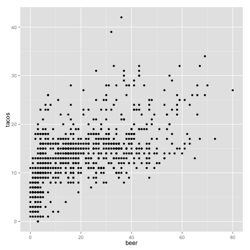
The default graph type is a point plot, but you can specify a wide range of different plots, called “geoms”. To specify a different type of graph, simply add ,geom = ""
qplot(beer, data = stereotypes, geom = "histogram")
stat_bin: binwidth defaulted to range/30. Use 'binwidth = x' to adjust
this.
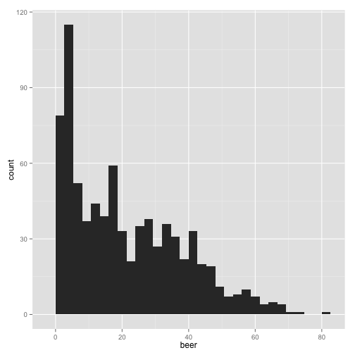
Did you see the message after you ran the script?
stat_bin: binwidth defaulted to range/30. Use 'binwidth = x' to adjust
this.
Make sure you read the output after you run the all code. Many times messages are built into programs to warn you of possible problems, even though the script has run successfully. In this case, this message is highlighting a way to manipulate the output that could potentially skew how you interpret the data. Let’s check it out.
qplot(beer, data = stereotypes, geom = "histogram", binwidth = 1)
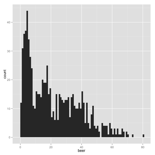
You could see how the interpretation of the graph would change dramatically if the bin width was higher.
qplot(beer, data = stereotypes, geom = "histogram", binwidth = 20)
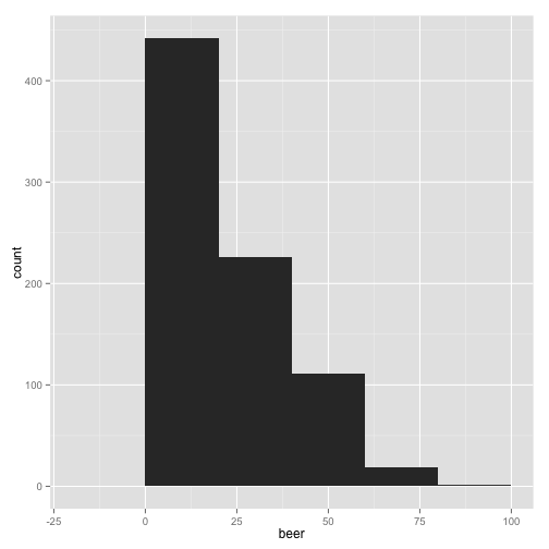
Those last plots were telling us how many observations have a particular amount of weekly beer consumption. We can see that most of the people surveyed drink under 20 beers a week. Now we want to quickly ask, does each group have similar observation distributions?
qplot(beer, data = stereotypes, geom = "histogram", fill = population)
stat_bin: binwidth defaulted to range/30. Use 'binwidth = x' to adjust
this.
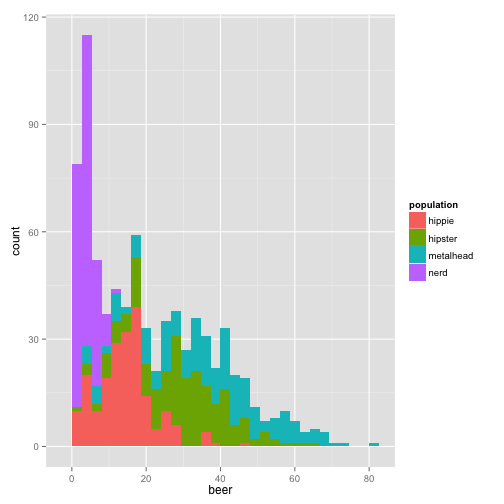
or another way to look at it,
qplot(beer, data = stereotypes, geom = "density", fill = population)
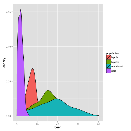
This graph is nice, but we can’t see all the distributions clearly. Let’s change the alpha, which is the transparency option.
qplot(beer, data = stereotypes, geom = "density", alpha = I(0.5), fill = population)
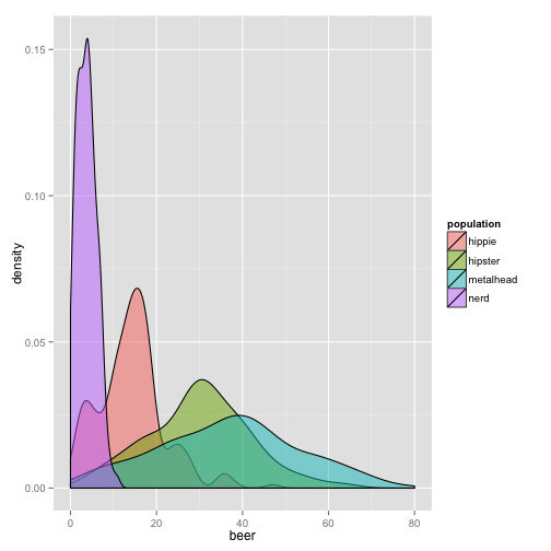
Try alpha without the I() aesthetic. What do you think it does? I() sets an aesthetic to a constant that is defined in the plot. This is setting, as opposed to mapping.
Setting Allows you to set to a constant within the graph.
Mapping Mapping is as if you are mapping a new variable. If you are creating a new variable, you get a new reference in the side legend.
This is one of those options that, although simple, saves you some frustration when trying to control your legend early in using gglplot2. In the future, when you become more advanced, the concept begins to allow great flexibility in controlling many informative layers of your visualization that make up more complex visual constructions.
Activity Break
There are many different geoms in ggplot2. You can go to the ggplot documentation page for guidance in this section.
-
View the distribution of showers. Color by population.
-
View the distribution of beer consumption and color by gender.
-
Find a way to create a plot using the the geom violin with the
stereotypedata set.
Combining Subset with Visualization
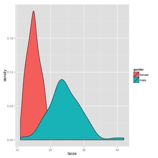
When you combine the power of subset with visualization you begin to see the real power of R to visualize your data. Let’s say we wanted to see if there is a difference between gender and taco consumption of a particular group.
First we need to isolate only one group. Let’s look at metalheads first.
metalheads <- subset(stereotypes, population == "metalhead")
Make sure you check to see if it works, by using one of the functions we explored earlier. Then continue with your new sub-setted data set, metalheads.
qplot(tacos, data = metalheads, geom = "density", fill = gender)
Activity Break
-
Make a graph that visually describes the difference between beer consumption between gender in the nerd category.
-
Using theggplot2 documentation, explore three different geoms, using either the full data set or a subset of the data. Tell me something interesting about the data.
-
From your exploration of the
stereotypesdata make three hypotheses about the data.
Visualization with the ggplot() function
qplot() is a great introduction to the power of R, but only allows one dataset and one set of aesthetic mappings. With ggplot() you are capable of building a plot based on layers, controlling each layer independently. So exciting.
The first thing to notice is that the syntax of ggplot() is different from qplot().
ggplot(stereotypes, aes(shower, fill = gender)) + geom_bar()
stat_bin: binwidth defaulted to range/30. Use 'binwidth = x' to adjust
this.

aes() is the section where we set the mapping aesthetics for the data. The base of this plot is where you call the data, but does not contain any layers yet. We can fit this base into one variable so we don’t have to think about it anymore.
p <- ggplot(stereotypes, aes(shower, fill = gender))
When you run p nothing will appear because you do not have any layers, which is the visual output. At a minimum there must be one layer, the geom. Layers are added with a plus sign.
p + geom_bar()
stat_bin: binwidth defaulted to range/30. Use 'binwidth = x' to adjust
this.
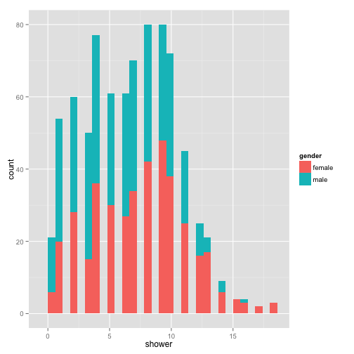
With each layer you add, you can manipulate the aesthetics separately. Let’s change a few of the geom_bar() aesthetics.
p + geom_histogram(binwidth = 1, position = "dodge")
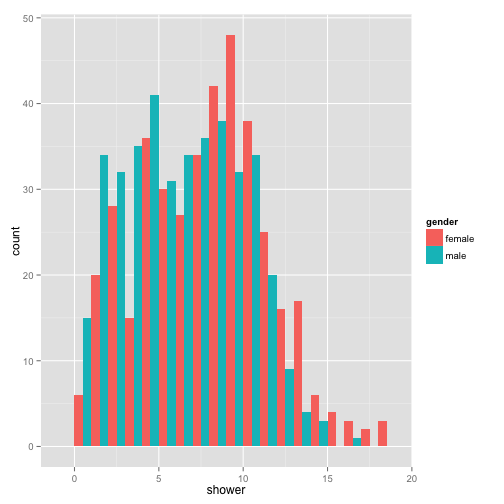
You can continue to add as many layers you want with fine control over each layer.
p + geom_histogram(binwidth = 1, position = "dodge") + coord_flip()
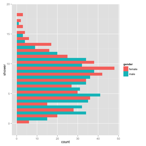
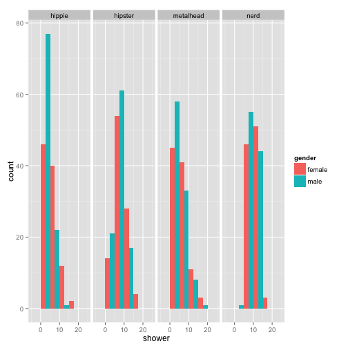
Another really informative way to view your information in your data is to view multiple graphs in one plot.
p + geom_histogram(binwidth = 5, position = "dodge") + facet_grid(~population)
Activity Break
-
With the
pbase layer, make a unique plot by adding additional layers. -
Make new base layer. Explore what the difference is between
color =andfill =. Use your own words to discern the difference.
Of course color is an option that can be adjusted many different ways. There are many ways to control the color aesthetic in your plots.
ggplot(stereotypes, aes(beer, tacos, color = population)) + geom_point() + scale_colour_brewer("clarity")
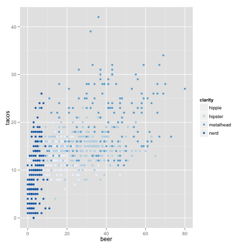
or you can specify points based on symbol.
ggplot(stereotypes, aes(beer, tacos, color = population, shape = gender)) +
    geom_point()
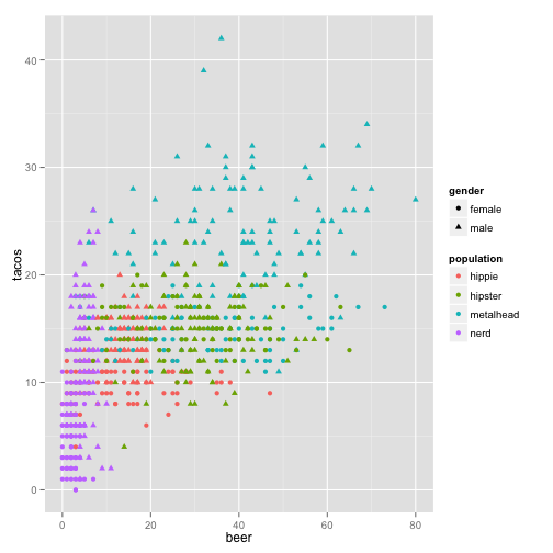
Looks like we learned that beer and taco consumption are slightly correlated, but do we truly know if tacos lead to beer or beer leads to tacos? One of life’s great mysteries.
Activity Break
-
Read about and use the following modifiers correctly with the any portion of the
sterotypesdataset you want. -
Modify color with
scale_color_hue() -
Make a tricked out box plot using the
stereotypesdata. Use at least 3 of the aesthetic options available for geom_boxplot. Useggplot2boxplot documentation for guidance.
Basic Statistics
We saw that there are many ways to view our data to try to get an feel for what sort of trends might be occurring, but in order to make some declarative statements about the data, we must do some statistical analysis.
Example 1- T-test for Internode Data
data file = stereotypes.csv
- Read in your data.
- Look at your data
- Ask a question
- Prepare Data
- Perform Analysis
stereotypes <- read.csv(file = "stereotypes.csv")
Let’s start by looking at the data.
head(stereotypes)
summary(stereotypes)
QUESTION Are there differences between drink consumption (coffee and beer) between males and females from the metalhead population?
Preparation of Data : Sub-setting and Adding Columns
First we need to isolate only the data we need. The select = c() at the end let us choose only the columns we need. Alternatively, you could use select = -c() to choose the columns you don’t want to include. Of course, without using subset you get all of the columns.
metalheaddrinks <- subset(stereotypes, population == "metalhead", select = c(population,
    gender, coffee, beer))
Always check your data.
summary(metalheaddrinks)
names(metalheaddrinks)
Now we want to add another column that is the sum of both coffee and beer.
metalheaddrinks <- cbind(metalheaddrinks, (metalheaddrinks$coffee + metalheaddrinks$beer))
You can see with the names() function the addition of the new column.
names(metalheaddrinks)
[1] "population"
[2] "gender"
[3] "coffee"
[4] "beer"
[5] "(metalheaddrinks$coffee + metalheaddrinks$beer)"
Do you see the default column name that was given to our new column. Pretty ugly. Let’s change it!
colnames(metalheaddrinks) <- c("population", "gender", "coffee", "beer", "sum")
names(metalheaddrinks)
[1] "population" "gender" "coffee" "beer" "sum"
The first step is to get a visual idea of what is happening. Let use your ggplot2 skills.
We can look at the if there is a difference in a number of ways. Overall we want to know if there is a difference in drinking between male and female.
Look at drinking distributions:
ggplot(metalheaddrinks, aes(gender, sum)) + geom_boxplot()
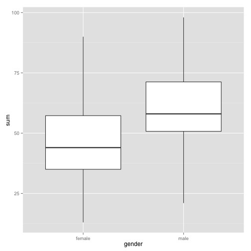
Visually is there a difference?
Activity Break
-
Find the distribution of each of the drink columns (beer, coffee, and sum) by gender.
-
Do they all say the same thing? Is there a visual difference between the genders? State your hypothesis.
Basic Statistics
While visual interpretation of data can help gain many insights into relationships and patterns that may be occurring, in order to infer appropriate conclusions we need to employ statistical tests. One thing to keep in mind is that R is a powerful tool for performing statististical tests, but it is only as powerful as your ability to use the right tool. This requires an understanding of statistics. I will not be covering the how to choose the right statistical test for a given data in this tutorial, but more to introduce how to use some of the most basic statistical functions in R.
Let us test if there is a statistical significant difference between drinking habits between male and females using a simple t-test.
t.test(metalheaddrinks$sum ~ metalheaddrinks$gender)
The t-test output tells us so important things.
Welch Two Sample t-test
-
data: metalheaddrinks$sum by metalheaddrinks$gender
-
t = -6.0437, df = 198, p-value = 7.358e-09
-
alternative hypothesis: true difference in means is not equal to 0
-
95 percent confidence interval: -18.820137 -9.559863
-
mean in group female = 45.69
-
mean in group male = 59.88
Activity Break
-
Is there a significant difference in drinking habits between female and male in the nerd population?
-
Is there a significant difference in number of showers between nerds and metalheads?
-
Is there a significant difference in taco consumption between female nerds and female metalheads?
Example 2 - ANOVA (Using real scientific data)
We just did a t-test many times to test significance between many difference categories, which is an inappropriate way to handle the data. Although t-tests are easy to conduct and understand, if you are doing many t-tests to find the difference between more than one treatment you are increasing your chances of performing a Type 1 error, which is an incorrect rejection of a null hypothesis, or a false positive. In other words, saying that there is a relationship in the data that simply is not there. Every time you do a t-test there is a 5% chance that you will perform a type 1 error. So when you do three t-tests, you are essentially increasing your risk for a type 1 error to 15%. When multiple treatments are present, many times you will run ANOVA analysis.
data file = hypocotyl.csv
About this dataset: We are going to use a more scientific dataset this time. A real dataset courtesy of the Maloof Lab. In this data set, multiple mutant plant lines. Mutant usually means that a particular gene becomes non-functional causing no protein product. For instance, the elf3 mutant means that this mutant line has a defect in the ELF3 gene and as a result, there is no ELF3 protein. Lines were grown in two light conditions, sun and shade. The Maloof lab is particularly interested in how a plant responds to shade, so the purpose was to see if there are any mutant lines that react differently to the sun and shade treatments.
In normal conditions, one of the responses plants have to shade is longer hypocotyls (stem region). This makes sense in that they are trying to reach sun by growing past whatever is shading them. One way to understand how an organism achieves these types of responses is to find genes that play roles in the process. In order to find genes that may be regulating this process the Maloof lab wanted to see if there are mutant lines that act differently to sun and shade then the normal response to shade (elongated hypocotyls).
Question Are there differences between hypocotyl length among the lines tested?
Since we are using a new data set, we should first get an idea of what the data set contains and how it is formatted.
First, import the data set into your R environment.
hyps <- read.csv("hypocotyl.csv")
Check your data set.
head(hyps)
    line hyp.length plate chamber light
1 elf3.1      2.602    C2       W shade
2 elf3.1      3.796    C2       W shade
3 elf3.1      3.772    C2       W shade
4 elf3.1      2.459    C2       W shade
5 elf3.1      2.828    C2       W shade
6 elf3.1      2.756    C2       W shade
What are some other ways to check your data set?
The experiment was performed in two different chambers. Because we don’t want to look at the effect of the chamber we will look at the results of the data only from one chamber, the LED chamber.
LED <- subset(hyps, hyps$chamber == "LED")
In order to get a feel for the data do some simple visualizations.
hist(LED$hyp.length)

plot(LED$line, LED$hyp.length, xlab = "line", ylab = "hypocotyl length (mm)")

What did those graphs tell us about the data?
ANOVA
Back to our question: Are the hypocotyl lengths different among the lines?
We now know it is statistically inappropriate to do a t-test on all of the lines. So we will try a more appropriate to tackle this question: an ANOVA.
First we run the test.
anova1 <- aov(hyp.length ~ line, data = LED)
Then we need to run the summary to see the results of the ANOVA.
summary(anova1)
Are there differences among the lines?
What are the means?
We can get more detail,
print(model.tables(anova1, "means"), digits = 4)
So, which means are smaller and which are larger?
Let’s look at some graphs with 95% confidence intervals. This means that 95% of the time, the “true real-life” mean of a sample will fall in these intervals
ggplot(LED, aes(light, hyp.length)) + geom_boxplot() + facet_grid(. ~ line)
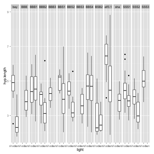
Anything weird about the behavior to the light treatment here? What can we see from this graph? Do you think that the different lines respond differently to the light treatment? If they did, this would be a light by line interaction. We can test for this in an ANOVA.
anova2 <- aov(hyp.length ~ light + line * light, data = LED)
lm2 <- lm(hyp.length ~ light + line * light, data = LED)
This does exactly the same thing as the anova, but it gives an easier output to read!
anova(anova2)
See it is the same.
anova(lm2)
You can even look at the interaction of every single line to each other.
summary(lm2)
Example 3 - Correlation with Stereotypes
Data file used: stereotypes.csv
One way to see if there is a correlation between two different measurement is to simply visualize on a point plot two observations one on the x-axis and one on the y.
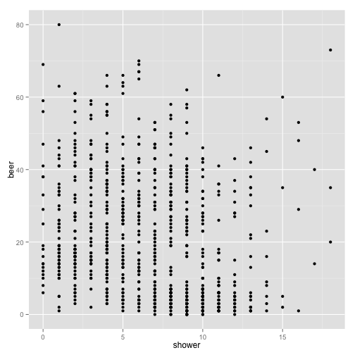
For instance we can ask the question: How are showers and beer consumption related? You can get a graphical view of this by making a scatter plot:
p <- ggplot(stereotypes, aes(shower, beer))
p + geom_point()
We then can add a line of regression. With the ````ggplotfunctionstat_smooth()```
p + stat_smooth(method = "lm") + geom_point()
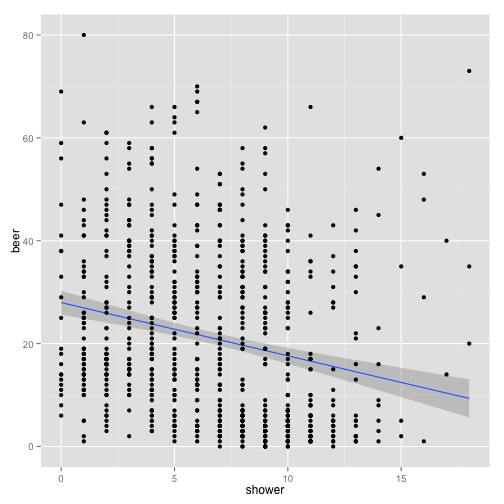
What is this plot telling us?
Activity Break
-
Make a scatterplot to see if there is any sort of correlation between beer and taco consumption. Make sure you add a line of regression.
-
Try two other interactions. What is your hypothesis?
Again, visual interpretation of a graph is important, but even more important is to run a statistical test. One way is to run the cor.test() function.
cor.test(stereotypes$shower, stereotypes$beer)
The ```cor.test()`` is one way to get do a statistical test on correlation.
Pearson’s product-moment correlation
- t = -6.5421, df = 797, p-value = 1.084e-10
- 95 percent confidence interval: -0.2905583 -0.1588803
- Sample estimates: cor -0.2257502
Activity Break
Using any of the three data sets:
- State three new hypothesis that have not been tested.
- Make three visualization that illustrate your hypothesis
- Do three appropriate statistical analysis to illustrate your conclusions.
Conclusion

You are now ready to start fighting the good fight against the ever increasing onslaught of data that is being thrown against humanity. We are in an exciting time in history, never have so many people been given the opportunity to find our own patterns in data to describe the world around us. Our curiosity is only limited by our endurance to keep asking questions. We are in an amazing era where information is all around us. Don’t forget that there are good programmers and there are bad programmers and this is not defined by how amazing you are at coding, but how you act in the programming community. Sure, Daredevil often acted alone in fighting evil, but he also used help from others super heroes. No matter the language you learn or project you are working on, always strive to make your code readable for others and when you get better, give back. Find your other mutant friends and fight.
Resources
There are many intricacies to everything I have mentioned above and the best way to learn about them more is to google it, seriously. R is an open source program which means it was made and maintained for free by a community. This means that there is a wealth of free information about every single detail of it, so take advantage of this fact always.
General Programming
Teach Yourself Programming in Ten Years Peter Norvig
Data Format and Structure
Why Geeks Love Plain Text (and You Should Too) CM Smith
Data Structures Hadley Wickham
Tidy Data Hadley Wickham
Data Types Julin Maloof
Data Visualization
ggplot2 Documentation Hadley Wickham
Visualization for Human Perception Stephen Few
My First Recommendation to New Scientific Coders: Learn Visualization Vince Buffalo
R Language Learning and Tutorials
R Cookbook Winston Chang
This tutorial was compiled using knitr.
Daredevil
Read Daredevil Comics at Marvel.com
Image Origins

Written by Mark Waid Pencils and Cover by Michael Allred Colors by Laura Allred

Panel from Daredevil #1 (April 1964), Written by Stan Lee Art by Bill Everett

"Showdown at Sea!"
Writers: Roy Thomas Pencilers: Gene Colan Inkers: Syd Shores Letterers: Sam Rosen Editors: Stan Lee
"The Widow Will Make You Pay!"
Writers: Gerry Conway Pencilers: Gene Colan Inkers: Ernie Chua Letterers: John Costanza

"Prey of the Hunter!"
Writers: Steve Gerber Pencilers Don Heck Inkers Sal Trapani Colourists Petra Goldberg Letterers Charlotte Jetter

"Collective (Part 5)" Writers: Brian Michael Bendis Pencilers: Mike Deodato Jr. Inkers Joe Pimentel Colourists: Dave Stewart Richard Isanove Letterers Richard Starkings Albert Deschesne
Please leave comments, especially if you have any ideas that could improve this tutorial.
comments powered by Disqus